HOW TO DESIGN A FLAG
Use 5 basic principles to create an outstanding flag for your organization,
city, tribe, company, family, neighborhood, or even country!
North American Vexillological Association.
The Flag Experts of the United States and Canada.
Vexillology is the study of flags.
WHAT IS A FLAG? -
A flag’s purpose is to represent a place, organization, or person, generally on
a rectangular piece of cloth, to be seen at a distance, often moving, and
reproduced in quantity and in many sizes.
The 5 principles of good flag design will lead to a successful flag that
accomplishes that purpose.
Flags began thousands of years ago, first used for military purposes on land and
then as identifying signals at sea. They evolved to represent royal houses, then
countries and other levels of government, businesses, military ranks and units,
sport teams, and political parties.
Flags grew out of heraldry—the practice of designing coats of arms—and follow
many of the same design principles. Following this guide will help any person or
group produce a great flag.
A flag should be simple, readily made, and capable of being made up in bunting;
it should be different from the flag of any other country, place or people; it
should be significant; it should be readily distinguishable at a distance; the
colors should be well contrasted and durable; and lastly, and not the least
important point, it should be effective and handsome. National Flag Committee of
the Confederate States of America, 1861
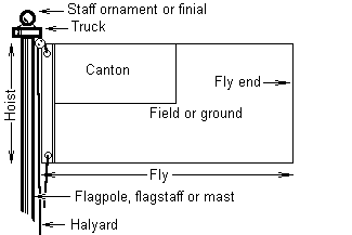
Anatomy of a Flag
THE 5 BASIC PRINCIPLES OF FLAG DESIGN
1. Keep It Simple -
The flag should be so simple that a child can draw it from memory…
2. Use Meaningful Symbolism -
The flag’s images, colors, or patterns should relate to what it symbolizes…
3. Use 2–3 Basic Colors -
Limit the number of colors on the flag to three, which contrast well and come
from the standard color set…
4. No Lettering or Seals -
Never use writing of any kind or an organization’s seal…
5. Be Distinctive or Be Related -
Avoid duplicating other flags, but use similarities to show connections…
1. KEEP IT SIMPLE
The flag should be so simple that a child can draw it from memory…
Flags flap. Flags drape. Flags must be seen from a distance.
Under these circumstances, only simple designs make effective flags.
Furthermore, complicated flags cost more to make, which often can limit how
widely they are used.
Most poor designs have the elements of a great flag in them—simplify them by
focusing on a single symbol, a few colors, large shapes, and no lettering. Avoid
the temptation to include a symbol for everybody.
Ideally the design will be reversible or at least recognizable from either side.
Don’t put a different design on the back.
| GOOD |
BAD |
 |
 |
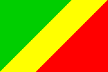
| Congo |
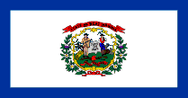
West Virginia (USA) |
| With bold, contrasting colors, large shapes,
and parallel lines, this flag is also easily recognized when reversed. |
The seal itself is complex, the white background is
boring, and the overall design differs from most other state flags only in
its blue border. |
| |
|
 |
 |
| Bangladesh |
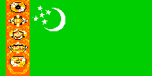
Turkmenistan |
| With two strong colors and a single symbol-the rising sun
of independence (slightly offset to the hoist), this flag succeeds well. |
This very complicated rug contains 5
traditional patterns! Better to leave it off and keep the moon and stars. |
| |
|
 |
 |
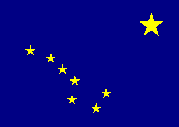
| Alaska (USA) |
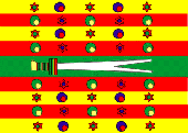
Bey of Tunisia |
|
The stars, a
standard U.S. symbol, form the “Big Dipper” constellation and the North
Star, representing the northernmost U.S. state. |
Replete with stars, crescents, and the Sword
of Ali, this 19th-century design’s overwhelming complexity
defeats its purpose. |
2. USE MEANINGFUL SYMBOLISM
The flag’s images, colors, or patterns should relate to what it symbolizes…
Symbolism can be in the form of the “charge” or main graphic element, in the
colors used, or sometimes even in the shapes or layout of the parts of the flag.
Usually a single primary symbol is best—avoid those that are less likely to be
representative or unique. Colors often carry meanings: Red for blood or
sacrifice, White for purity, Blue for water or sky.
Diagonal stripes are often used by former colonies as an alternative to the
generally horizontal and vertical stripes of European countries.
| GOOD |
BAD |
 |
 |
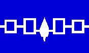
| Iroquois Confederacy (USA) |
Navajo Nation (USA) |
| “Hiawatha’s Belt”, a symbol for five tribes since before
1600, appears on the traditional blue of wampum shell beads. |
Over 20 graphic elements overwhelm the viewer
and none are large enough to be seen easily. |
| |
|
 |
 |
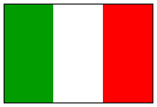
| Italy |
Akita (Japan) |
| Based on the revolutionary flag of France, the vertical
orientation of Italy’s stripes represented a challenge to the typical
horizontal stripes of the ruling kingdoms of Europe. |
This symbol is distinctive but lacks
universal meaning. A stylized Katakana character “A”, only Japanese can
recognize it, and it is not reversible. |
| |
|
 |
 |
| Ukraine |
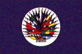
Organization of American States |
| The light blue and yellow represent the sky
over wheat fields—both the color and the direction of the stripes carry
the meaning. |
Believe it or not, this flag depicts the flags of all the
member countries, and must be changed each time one joins, drops out, or
changes its flag! |
3. USE 2-3 BASIC COLORS
Limit the number of colors on the flag to three, which contrast well and come
from the standard color set…
The basic flag colors are Red, Blue, Green, Black, Yellow, and White. They can
range from dark to light. Occasionally other colors are also used, such as
Purple, Gray, and Orange, but they are seldom needed in a good design.
Separate dark colors with a light color, and light colors with a dark color, to
help them create effective contrast. A good flag should also reproduce well in
“gray-scale”, that is, in black & white shades.
More than four colors are hard to distinguish and make the flag unnecessarily
complicated and expensive. Flag fabric comes in a relatively limited number of
colors—another reason to stick to the basics.
| GOOD |
BAD |
 |
 |
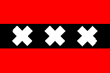
| Amsterdam (Netherlands) |
Chinese Admiral (1882) |
| These colors contrast well, even though the
red and black are not separated by a light color. |
Too many colors! At the least, the yellow and white should
be separating the dark colors. While the dragon is in the position of
honor, it is very hard to distinguish. |
| |
|
 |
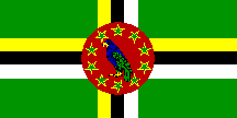 |
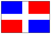
| Dominican Republic |
Dominica |
| These colors provide balance and contrast, leaving a white
cross as negative space” in the middle of the flag. |
By using ALL six basic flag colors, this flag creates
unnecessary cost and complexity. Who can see the parrot’s red and black
eye? |
| |
|
 |
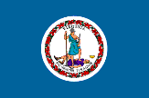 |
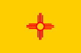
| New Mexico (USA) |
Virginia (USA) |
| Red and yellow recall the state’s Spanish heritage, while
the sun symbol comes from the Zia Indians. This design was voted the best
U.S. state flag by NAVA members. |
Imagine, 18 different colors in the official flag
specifications! Not only are they difficult to distinguish, but having
that many colors drives up the manufacturing cost. |
4. NO LETTERING OR SEALS
Never use writing of any kind or an organization’s seal…
Words defeat the purpose: why not just write “U.S.A.” on a flag?
A flag is a graphic symbol. Lettering is nearly impossible to read from a
distance, hard to sew, and difficult to reduce to lapel-pin size. Words are not
reversible—this forces double- or triple-thickness fabric.
Don’t confuse a flag with a banner, such as what is carried in front of a
marching band in a parade, or draped behind a speaker’s platform—such banners
don’t flap, they are seen from only one side, and they’re usually seen
closer-up.
Seals were designed for placement on paper to be read at close range. Very few
are effective on flags—too detailed. Better to use some element from the seal as
a symbol. Some logos work; most don’t.
| GOOD |
BAD |
 |
 |
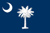
| South Carolina (USA) |
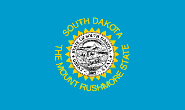
South Dakota (USA) |
|
The palmetto
tree represents “Palmetto State” far better than the state’s seal could.
The crescent moon is in the position of honor. |
This flag uses a seal AND lettering! The
name of the state actually appears twice. |
| |
|
 |
 |
| Côtes d’Armor (France) |
Loir-et-Cher (France) |
| Rather than the logo style frequently used by French
departments and regions, Côtes d’Armor uses a stylized seagull in the
shape of its coastline. |
All those words, plus an indistinguishable
gray shape… Better to have used the stylized dragon on a more interesting
background color. |
| |
|
 |
 |
| Peguis Nation (Canada) |
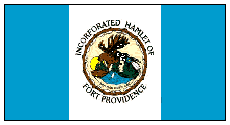
Fort Providence, NWT (Canada) |
| The contrasting colors with a single central
symbol represent this Indian nation far better than could any seal. |
Despite the overall pattern recalling Canada, this flag
(for an Indian community) stumbles with a virtually indistinguishable
seal. |
5. BE DISTINCTIVE OR BE RELATED
Avoid duplicating other flags, but use similarities to show connections…
This is perhaps the most difficult principle, but it is very important.
Sometimes the good designs are already “taken.” However, a flag’s symbols,
colors, and shapes can recall other flags - a powerful way to show heritage,
solidarity, or connectedness. This requires knowledge of other flags.
Often the best way to start the design process can be looking to one’s “roots”
in flags—by country, tribe, or religion.
| GOOD |
BAD |
 |
 |
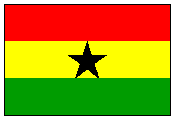
| Ghana |
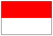
Indonesia |
| Using the same colors used by many countries
in Africa, this flag shows a strong connection to its neighbors’ flags. |
Except for its proportions, this flag is exactly the same
as Monaco’s (which had it first), but there is no connection between the
two countries. Upside-down it is the same as Poland or as Cantabria,
Spain! |
| |
|
 |
 |
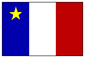
| Acadia (Canada) |
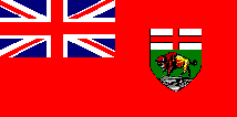
Manitoba (Canada) |
| French-speaking Acadians in Canada place a
yellow star for St. Mary, their national symbol and patron saint of
mariners on the flag of France. |
While the British “Red Ensign” signifies connectedness
within the Commonwealth, the distinguishing feature is the small seal.
Better to have used the bison as the main flag symbol. |
| |
|
 |
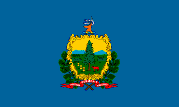 |
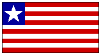
| Liberia |
Vermont (USA) |
| Founded by freed slaves from the U.S., Liberia reflects
that heritage with a similar yet distinctive flag. |
This flag is virtually indistinguishable from
20 other U.S. state flags, all with a seal on a blue field. |
OTHER CONSIDERATIONS
A rectangle is the standard flag shape. Keep the width-to-length proportions
between 1:1.5 and 1:2. Canadian flags are usually 1:2; U.S. flags are usually
1:1.5 or 1:1.67. Square flags are unusual in North America. Abandon such
rectangles only when meaningful.
Flags wear. By retaining a rectangular shape and avoiding symbols at the fly
end, a flag can be hemmed repeatedly and given a longer life.
The point of honor is the “canton” area—the upper-left corner. This corresponds
to the part of the flag that is seen when it hangs limp from a flagpole. The
center or left-of-center position is the most visible spot for a symbol when the
flag is flying.
Consider the fabrication methods. Curved lines add to the cost of sewn flags.
Holes or “negative space” hurt a flag’s fly-ability and wear-ability.
“Swallow-tail” shapes fray more easily.
 |
 |
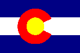
| Colorado (USA) |
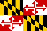
Maryland (USA) |
All rules have exceptions. Colorado’s “C” is a stunning graphic element.
Maryland’s complicated heraldic quarters produce a memorable and distinctive
flag. But depart from these five principles only with caution and purpose.
Don’t allow a committee to design a flag. Instead, empower individuals to design
flags, and use a committee to select among them.
An old rule of heraldry has images of animals look toward the hoist.
And most of all, design a flag that looks attractive and balanced to the viewer
and to the place, organization, or person it represents!
The North American Vexillological Association (NAVA) is dedicated to the study
of flag history and symbolism. For more information about its activities,
publications, and membership, visit its web site at
www.nava.org or write: NAVA,
1977 N. Olden Ave. Extension, PMB 225, Trenton, NJ 08618-2193, U.S.A.
This guide was created by Ted Kaye, managing editor of RAVEN, a Journal of
Vexillology (published annually by NAVA).
Another resource to help with flag design, identification, and history:
www.fotw.net
These principles of good flag design distill the wisdom of many people who have
written on the subject, including: Philippe Bondurand, Frederick Brownell,
William Crampton, Michael Faul, Jim Ferrigan, Richard Gideon, Kevin Harrington,
Lee Herold, Ralph Kelly, Rich Kenny, David Martucci, Clay Moss, Peter Orenski,
Whitney Smith, Steve Tyson, Henry Untermeyer, and Alfred Znamierowski.
© 2001 North American Vexillological Association